The Edge Was Selectable but Invisible: A Small Plan Canvas Lesson
Plan Canvas could select a connection edge, but generic styling hid the selected state. A small visual fix made complex paths traceable again.

Complex visual tools can fail in a surprisingly quiet way: the feature works, but the interface does not show that it worked. That was the problem we found in Plan Canvas, TekeraLab’s visual workspace for connecting tasks, decisions, and workflow steps.
The feature already existed
On a busy canvas, a user needs to select one connection edge and follow its path to the destination node. Plan Canvas already supported that behavior. Clicking the edge changed its internal state, so the technical interaction was not missing.
The problem was the result on screen. The selected edge looked almost identical to every other connection. A user could click correctly and still wonder whether anything had happened.
General styling hid the selected state
We had introduced shared visual rules to make edges readable in both light and dark themes. Those rules gave connections consistent color and thickness, but they were too broad: they also overwrote the special style of the selected edge.
The correction was deliberately small. The common rule now applies only to ordinary edges. A selected edge keeps a stronger color and width, and its arrowhead follows the same state. The path is visible across nodes and at both ends of the connection.
Why a visual check mattered
A behavior test could confirm that the selected value changed. It could not prove that a person could see the change on a crowded board. Looking at the real interface revealed the gap immediately.
This is an important lesson for diagram editors, dashboards, and other complex interfaces: state changes must happen and they must be legible. Focus, selection, error, and completion all need a visual signal that survives the rest of the design system.
A small fix with a wider lesson
The fastest answer was not to build a new feature. It was to understand why an existing feature had disappeared from the user’s perspective. That distinction avoids unnecessary code and keeps the product easier to maintain.
A good interface does more than behave correctly. It tells the user, clearly and immediately, what just happened.
Ask a question
Got a question about this post? Drop your email and we’ll reply.
Get notified of new posts
1–2 emails a month on social media, AI and running a small business. No spam.
Related posts

Why Smart Publisher Needed Privacy and a Stable Technical Identity Before Google Play
Before Smart Publisher entered Google Play testing, we aligned its privacy page, permanent Android identity, and product history with what the app actually does.

Smart Publisher Schedules Now Survive Phone Restarts and App Updates
Testing the real Google Play bundle exposed a reliability issue: pending schedules could disappear after a restart or update. The fix is implemented and verified.
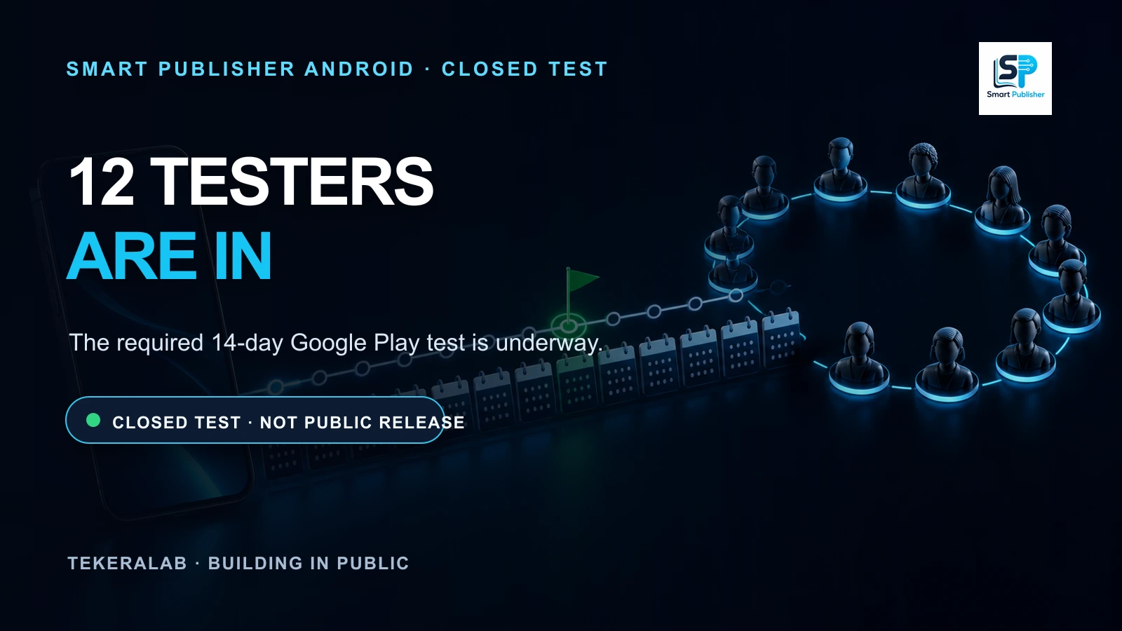
Smart Publisher Android Begins Its 14-Day Google Play Closed Test
Twelve testers are now opted in to Smart Publisher Android’s closed test. The required 14-day Google Play testing period is underway.